
American Oak Brand Identity

I developed a refined, craft-focused identity for American Oak Distillery, creating a flexible visual system spanning spirits packaging, hospitality, and print.
BRAND IDENTITY
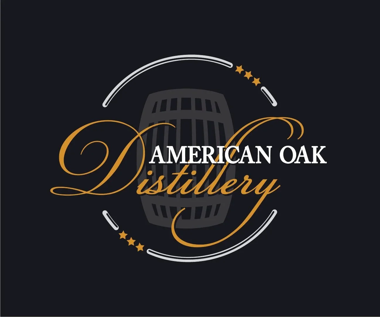
The American Oak identity was designed to reflect the character of a small-batch Adirondack distillery while creating a recognizable foundation that could grow with the business. Bold typography, barrel-inspired imagery, and a restrained black-and-gold palette established a visual language that feels handcrafted, established, and distinctly American Oak.
Building a Brand Around Craft

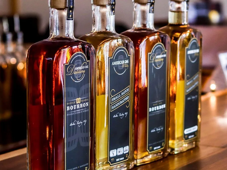
BOTTLE PACKAGING
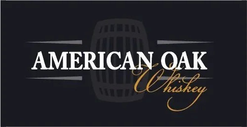
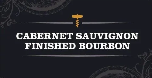
The packaging system established a shared visual language while giving each spirit its own identity. Consistent typography, linework, and label structure tie the collection together, while individualized illustration and graphic details reflect the character of each release.
Distinctive by Design




BEYOND THE BOTTLE
The Oak Room
The Oak Room, American Oak's restaurant and tasting room, received its own identity derived from the parent brand. Shared typography, color, and barrel imagery maintained the connection to American Oak while giving the space a distinct presence of its own.
Extending the Experience
Print Collateral
A rack card extended the identity into print, promoting both the distillery and Oak Room as connected Adirondack destinations.
CREATIVE THINKING
STRATEGIC DESIGN
LASTING IMPACT