

Common Roots Beer Packaging

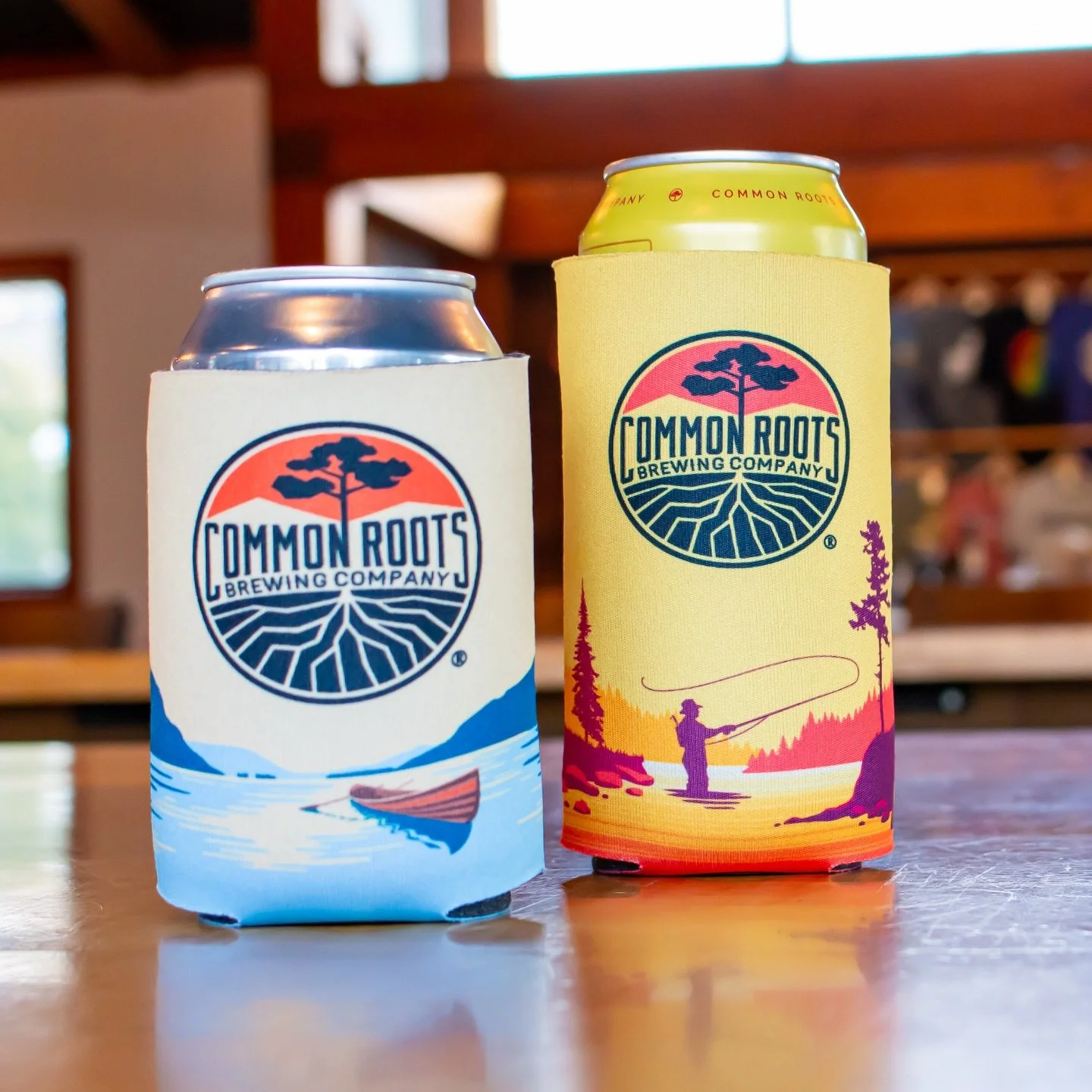
Over several years, my work with Common Roots grew from illustrated beer packaging into a broader creative partnership, bringing the brand’s outdoorsy, adventurous spirit to life across packaging and beyond.
Client: Common Roots Brewing Company
Location: South Glens Falls, NY
Website: Visit Common Roots Brewing →
CONCEPT & ILLUSTRATION
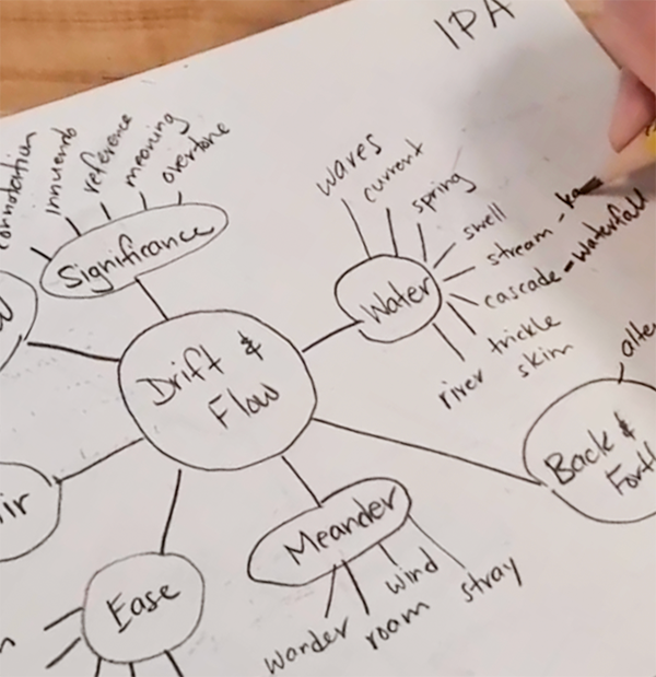
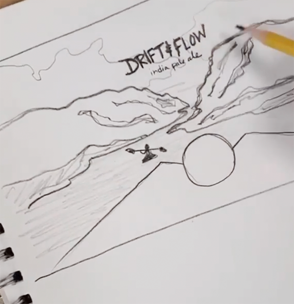
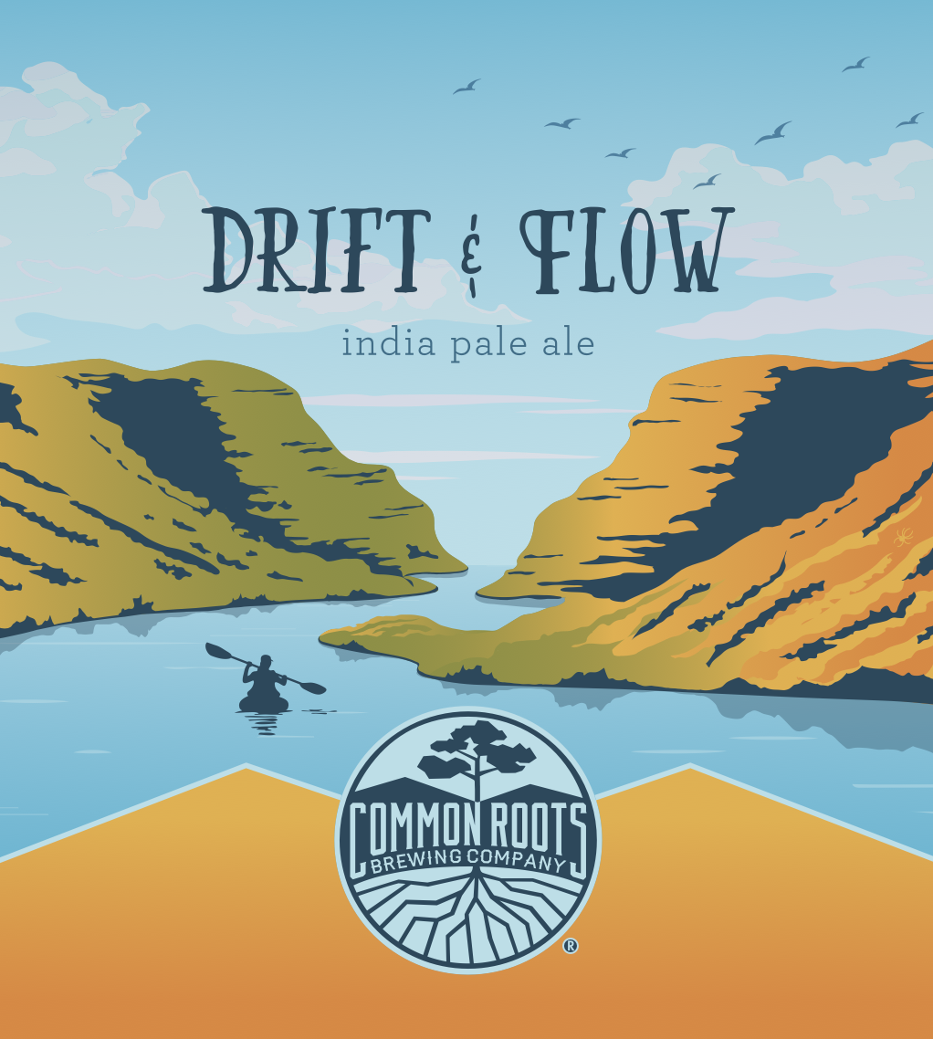
Drawing from local landscapes, I developed a bold illustration style built around simplified forms, vivid color, and a strong sense of place.
A Distinct Visual Language
CAN PACKAGING
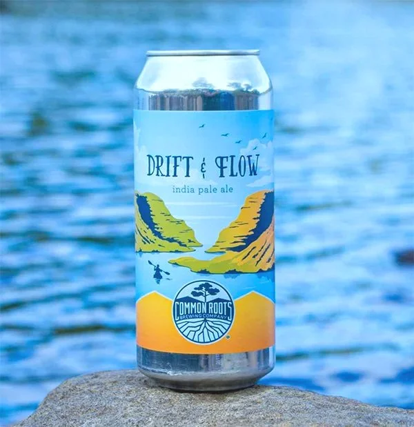
Each beer has its own story, illustration, and color palette, while a consistent structure keeps the collection cohesive and recognizable. The system was designed to grow, allowing new releases to feel distinct while still belonging to the same family.
A Cohesive System Built to Grow
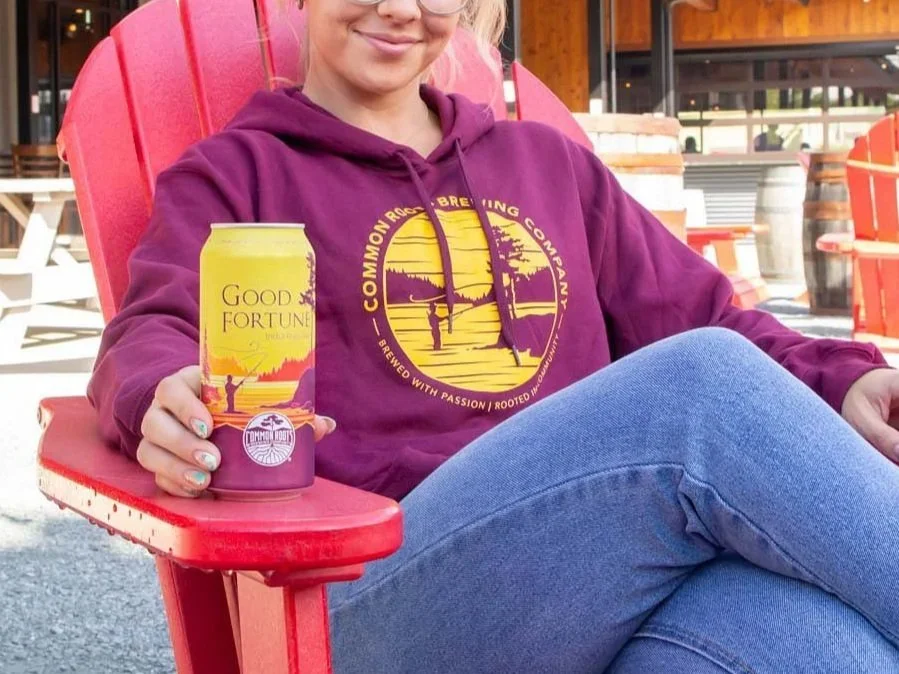
Good Fortune grew from a 16oz can into a flagship packaging family spanning 12oz cans and cartons. Designed for direct-to-can printing, the original artwork worked within a six-color limit, using a tightly controlled palette and overlapping shapes to create depth while keeping the identity consistent across formats.
Designed to Adapt
FLAGSHIP IPA
BOTTLE SERIES
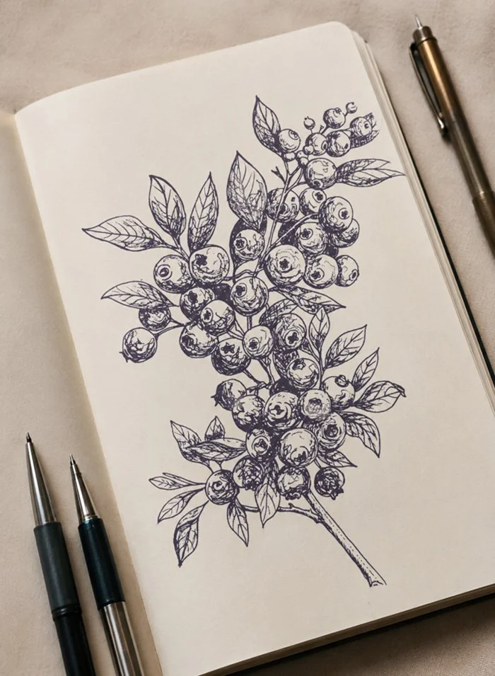
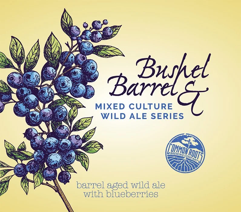
For Common Roots’ specialty bottle releases, I created original hand-drawn illustrations paired with expressive typography, giving the series a more intimate, small-batch character.
A Hand-Drawn Approach

BEYOND THE PACKAGE
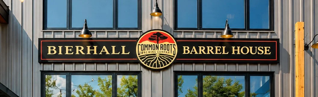
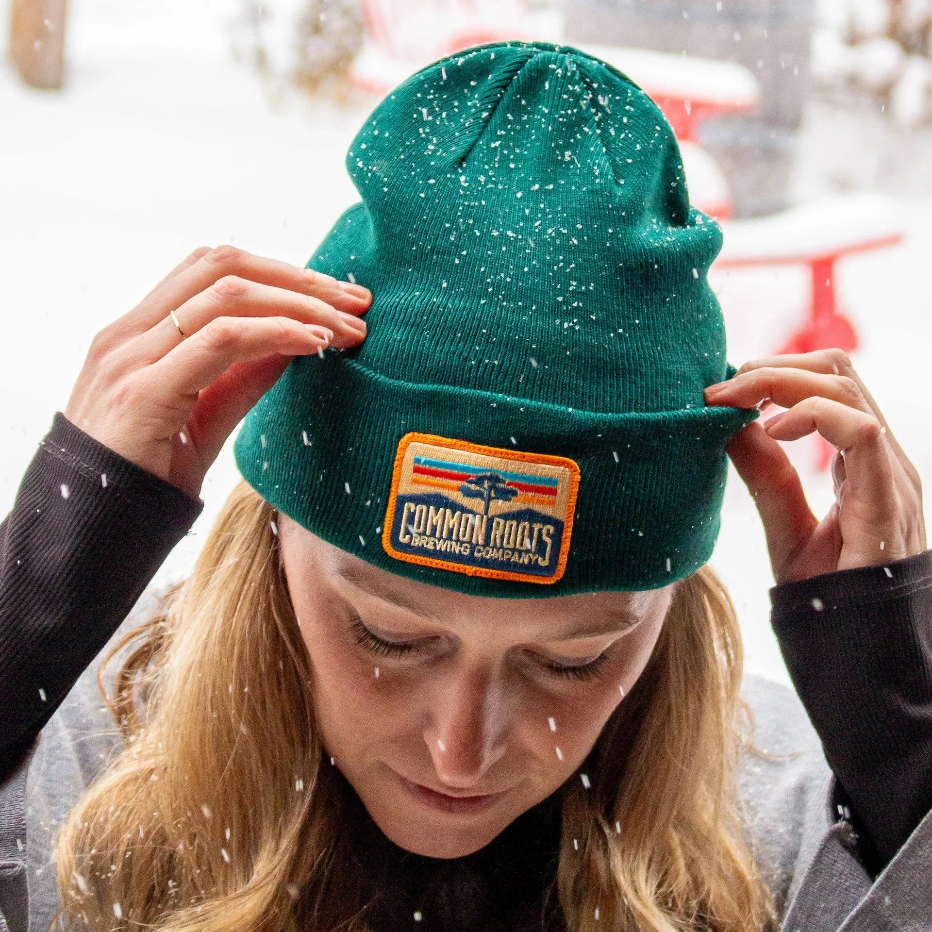
The visual language extended beyond packaging into merchandise, signage, environmental graphics, and other applications, creating a consistent and recognizable brand wherever it appeared.
Extending the Brand

CREATIVE THINKING
STRATEGIC DESIGN
LASTING IMPACT